
Artwork: Self Portrait
|
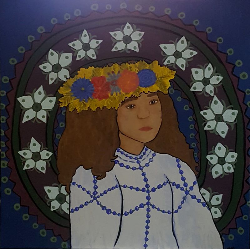
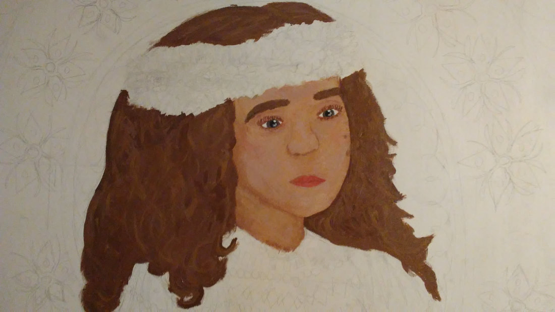
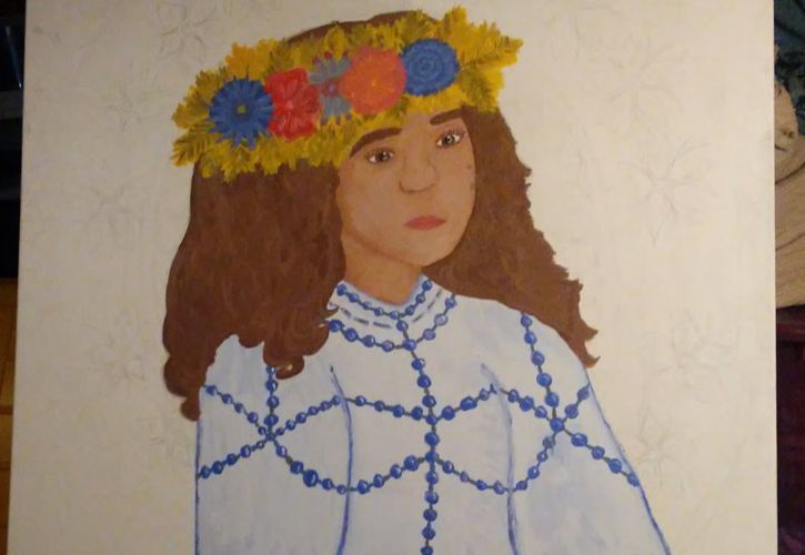
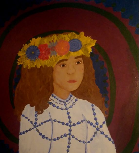
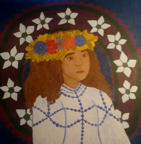
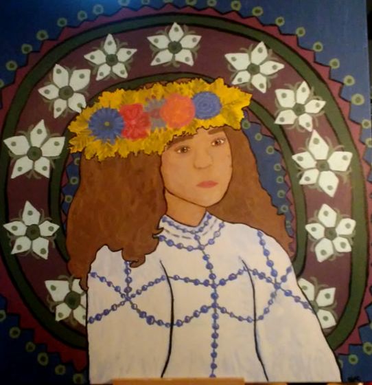
Title: Self-Portrait One
Size: 91.44 cm x 91.44 cm Medium: Acrylic paint on canvas Completion: March 17, 2019 Self-Portrait One is an acrylic painting on a hand-stretched canvas. This piece was inspired by the Czech culture symbols evident in Alphonse Mucha's Pieces; Bières de la Meuse, Job and Moët & Chandon: Dry Imperial. Self-Portrait One depicts patterns and traditions of Czech culture which are evident and many pieces of work done by Alphonse Mucha and was created to showcase the beauty in the Czech culture as well.
|
Inspiration
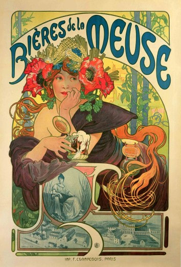
Mucha, Alphonse. Bières de la Meuse, 1897. Color lithograph. Muchafoundation.org.

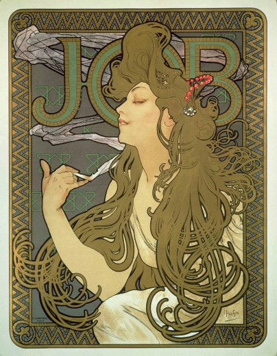
Mucha, Alphonse. Job, 1896. Color lithograph. Muchafoundation.org.
|
For my inspiration I looked mainly at Mucha's color lithographs which feature beautiful women and geometric designs. I loved the textures and use of color and line within the piece and felt a connection to Mucha's style because of the cultural aspects he included. Mucha was Czech and often included his culture into his own work, which I wanted to be able to do in my self-portrait because I have never really known exactly where I was from until I was a certain age, and I want to be able to show my culture to people since not many people know much about the Czech people.
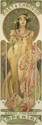
In Bières de la Meuse, I liked the flower crown and the bright hues of color and when researching I found out about an event that the Bohemian Czechs do as a harvest festival in which women wore wreaths made out of wheat to celebrate. I felt like that would be a cool celebration to include in my piece. In Job, I liked the use of color in the skin tones, how it looked like a well-blended skin tone and one united piece of color whose value shifted. In Moët & Chandon: Dry Imperial I was inspired by the clothing on the woman. I wanted to use the traditional, beaded look to the clothing and the geometric designs included in the background of the piece. |

Mucha, Alphonse. Moët & Chandon: Dry Imperial, 1899. Color lithograph. Muchafoundation.org.
|
Planning
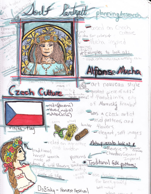
Original planning and research page within my sketchbook before the formal planning.
|
In my planning phase I began with researching more of the Czech culture and Alphonse Mucha in general to gain some ideas on what aspects of his works I wanted to include within my piece. In the picture to the left, I drew the rough sketch of myself and my original ideas of what I wanted the piece to kind of look like. I didn't use much accuracy with it, but rather wanted to collect all my ideas down in one picture so I could build a more correct looking piece later on.
|
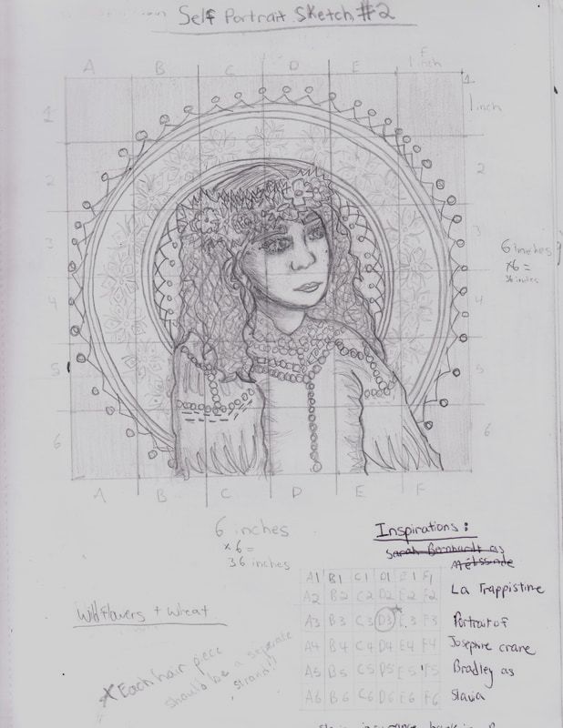
Initial grid drawing planning sketch.
|
|
In the lower right, the image shows the calculations of the sizes of grid I should be making on my sketch versus the sketch I would transfer onto my canvas later on. It didn't take long for the math, but I wanted to make sure I was organized enough for this piece before I began on the actual canvas itself. In the upper right, the image shows my final planning sketch for my piece using an overlaying grid method once I completed the sketch, I free-handed the sketch from a picture of myself that I took, and created a rough diagram of what I wanted each separate square to include in the piece. I planned to rely on dark, black outlines like Mucha had in his own works, but wanted to save them for the very last stage of my painting. I also decided to use geometric flowers in the background to blend Mucha's use of organic flowers with the geometric shapes that I lover in the background of his pieces.
|
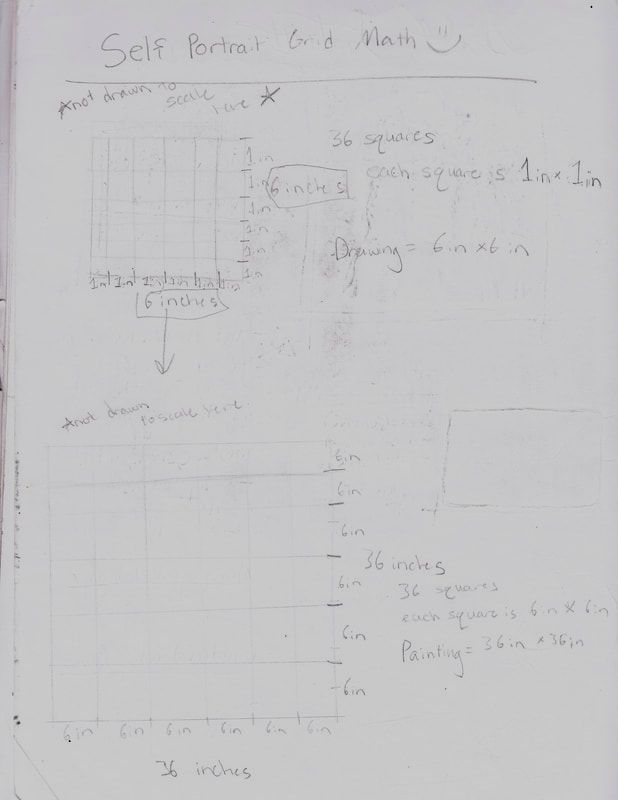
Calculations of equivalents between canvas grid and sketch grid. (click to view larger and be able to read it)
|
Experimentation
(Click to enlarge)
|
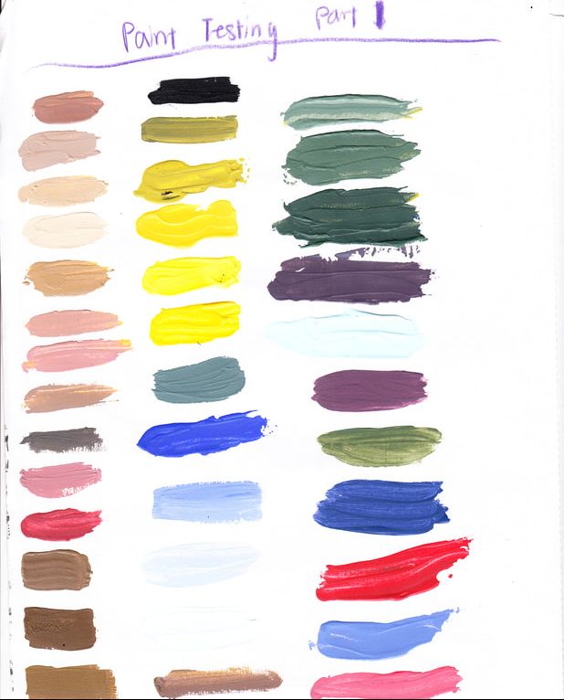
While painting, it took me a couple tries to get the colors of the pieces looking the way I wanted, especially since the acrylic paints dried quickly and darker than the color that I had mixed. To the left is one of the pages of paint swatches I took while painting in order to keep track of my paint colors for future reference if my color had dried out too quickly or if I needed to touch up certain spots. The skin tones and hair tones took up a lot of my experimenting, and I struggled as first with coming up with a good air color to highlight my curly hair within my piece.
|
|
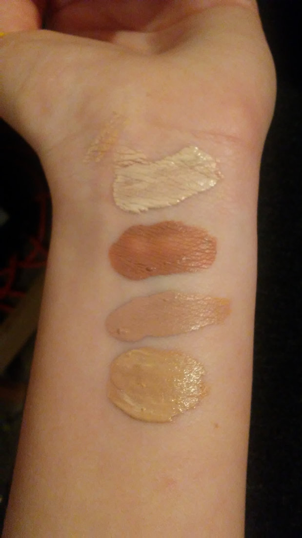
To the left if a picture of my experimentation with skin tones. I used my arm to match certain high tones and low tones of my skin to, and tried making the lighter tone that I had made darker and more red, slightly less dark, and a little more yellowish to give an olivey undertone to the skin.
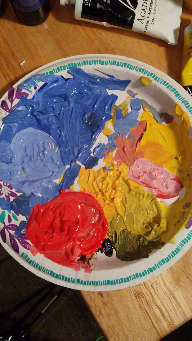
To the right is an image of the constant reworking and experimentation that I used to created the wheat and flowers in the crown. I couldn't chose between blue and red, so eventually I decided to use different tones of both for the flowers and different yellows for the wheat. |
|
|
|
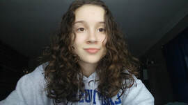
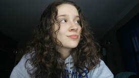
The two pictures of myself (above) and some of the several attempts that I had with posing for my piece. I wanted something regal, but not forced, and something prestigious, but also laid back and accepting. I did almost a mixture of these two with the positioning, but decided to use and image of myself with my head turned ever-so-slightly and my shoulders in a position like photo #2 above. I also used these images to help figure out any patterns between my curls and determine how exactly I should depict them when doing a piece about one of my cultures, who is not normally known for having curly hair. Eventually I decided to use my natural hair in the piece because like my cultures, I had not really fallen in love with it up until very recently in my life
Process
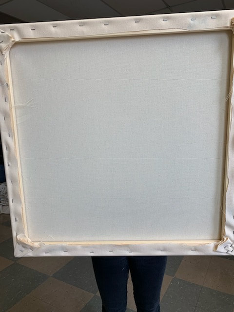
Stretching a Canvas:
|
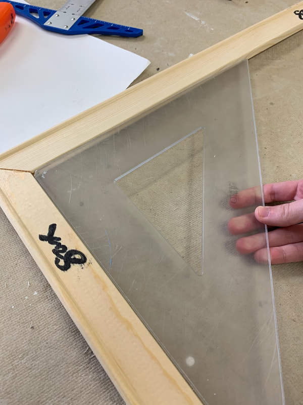
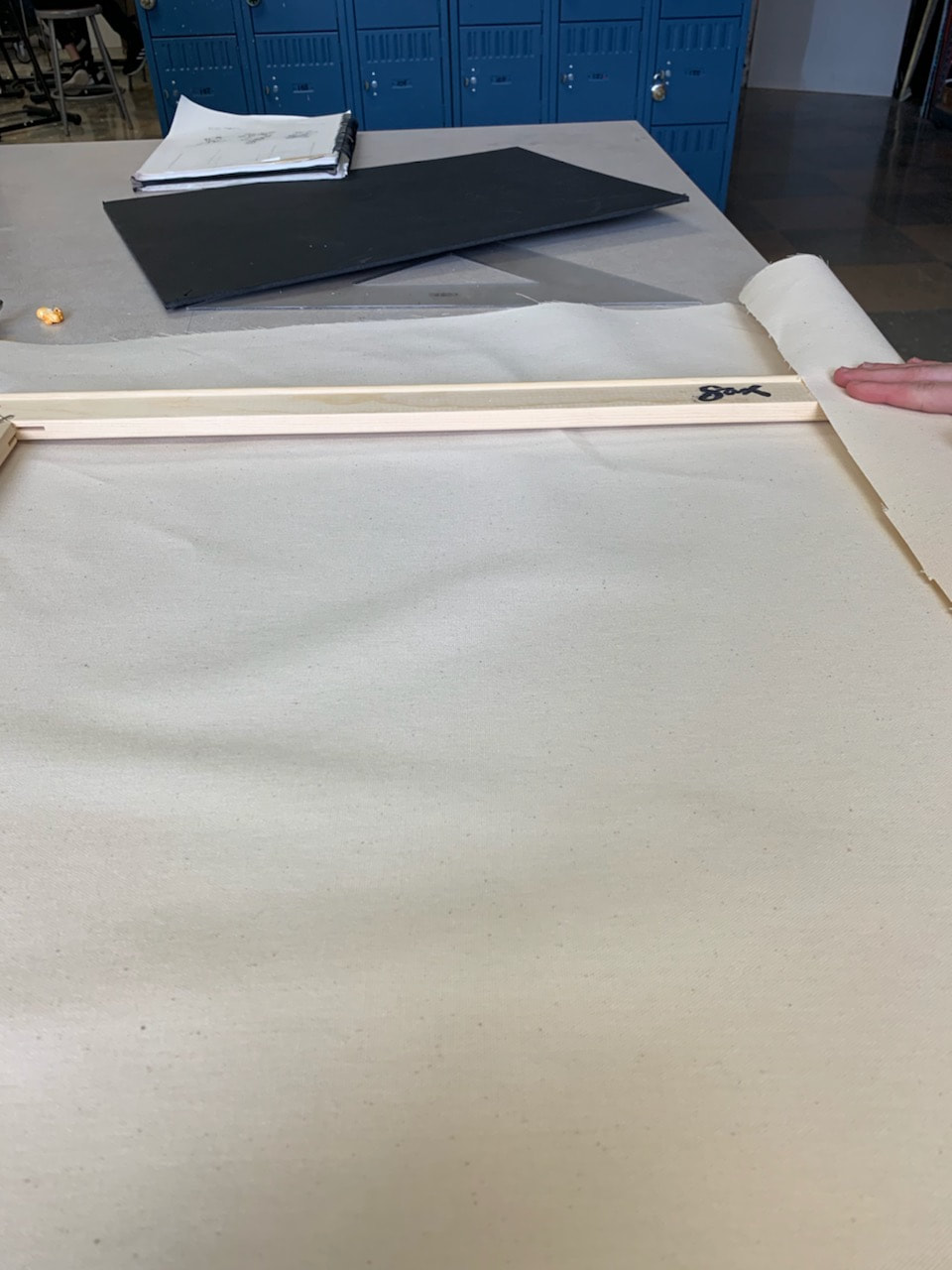
To begin, I took the 91.44 cm (three foot) frame pieces that were provided by my art teacher and snapped them together. I then used the carpenter's triangle and placed the side with the 90 degree angle in the corners of the frame pieces that were snapped together.
|
|
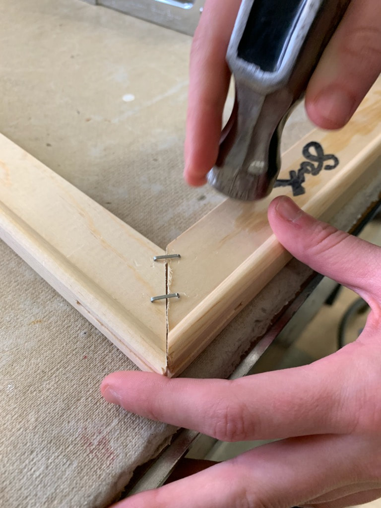
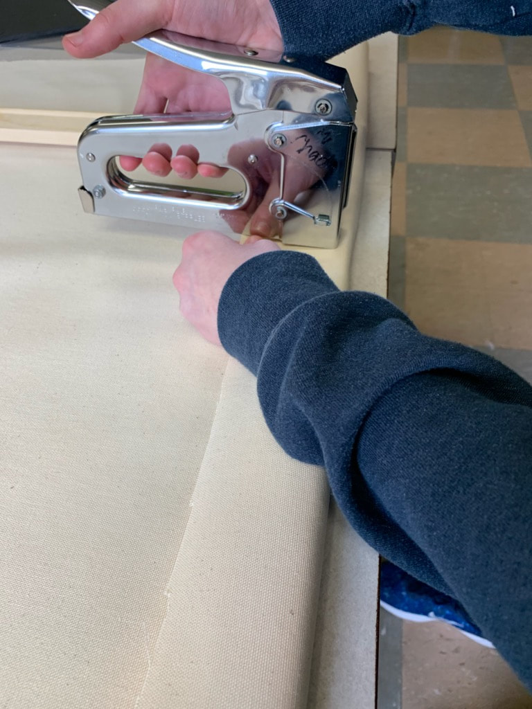
If it was square, then I used the staple gun and put two staples over the part where the pieces snapped together (as shown in the image to the left), and if the pieces were not square, then I would adjust the sides until they were. If the staples were lose, or seemed lose, I took the hammer and gently hammered the staples in farther without wrecking the frame.
|
|
Next, I moved the frame of the canvas to the side and rolled out the lag spool of canvas material on the table top I was working. I then placed the canvas frame, with the staple side facing up, onto the canvas material I had just rolled out and made sure it was centered before I cut around the frame, leaving about 5 inches on the outside to make sue I had enough canvas for the next step.
|
|
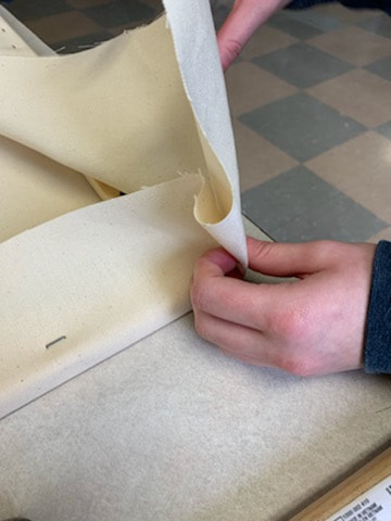
Taking the first side, I pulled the canvas over the top of the frame and placed a staple through the canvas and onto the frame using the staple-gun. I repeated this about 8 times or so on the first side. I repeated this step with the side across from the first side of the frame, pulling the canvas tight, but enough for the canvas to have a small bounce to it once touched. I them did this with the other two sides.
|
|
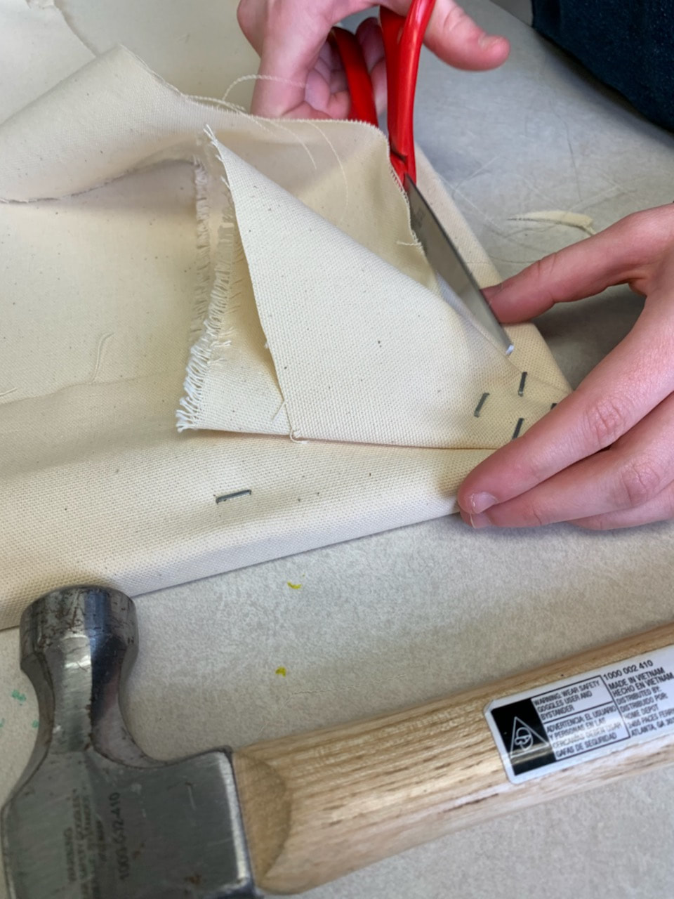
Then, I secured the corners of the piece by folding the canvas and stapling it down a couple times in order to make sure the corners were clean and sturdy. I hammered the staples that I put in to make sure they were more secure.
|
|
|
Once I secured the corners and made sure the staples were fully down, I carefully used the scissors to remove the excess canvas from the back of the canvas and discarded the extra material. If there was any loose strings or fraying of the canvas I cut the strings off, but did not pull on them because I was worried that the piece may unravel farther.
|
Painting:
|
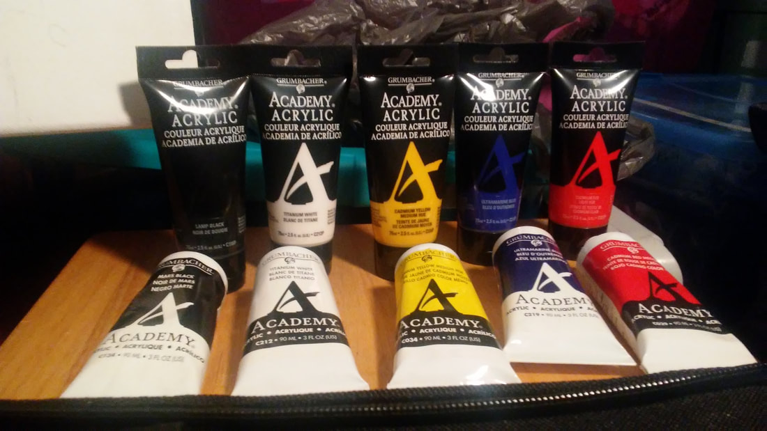
Before I began painting, I used Trueflow white acrylic gesso and did two layers of it. The paints that I used for this piece are Grumbacher Academy Acrylic paints in the colors titanium white, cadmium red light hue, cadmium yellow medium hue, ultramarine blue, and mars black.
|
|
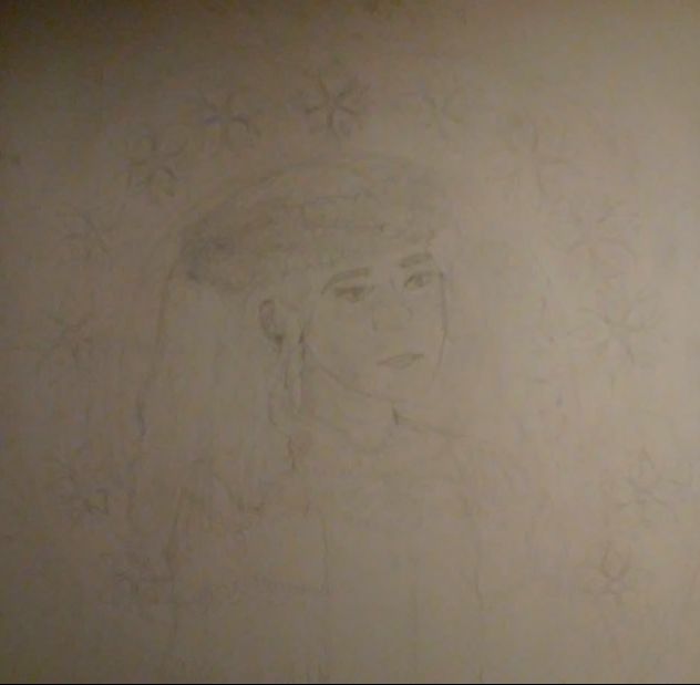
Once the gesso was dry on the canvas, I took the canvas and a ruler to sketch the grid proportionate to the one from my sketch. I then used the grid to sketch the outline of my face, body, and background. Based on how long it took to sketch and do the grid method, I think next time I will try using the projection method to get a more accurate lining and anatomically correct piece.
|
|
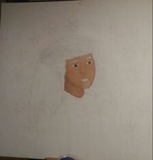
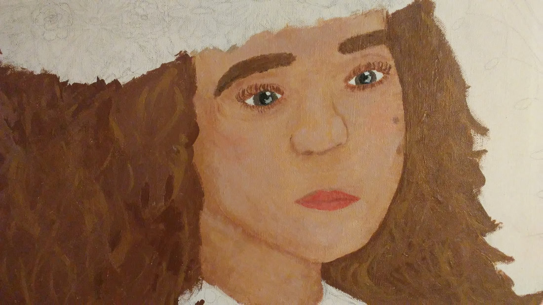
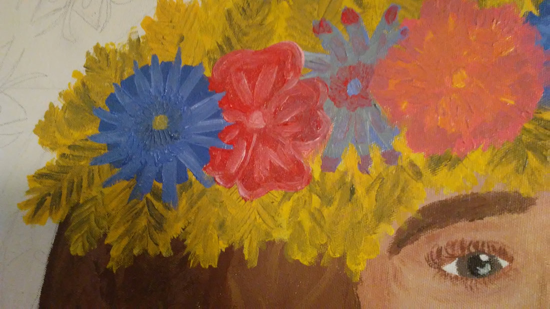
Using the skin tones that I experimented with, I began by painting my face because I figured it would be one of the harder parts of my painting and wanted to start there in case I messed up on it. I tried to get all the highlights correct and the gradation of the shadows on my neck. I used the titanium white, cadmium red light hue, cadmium yellow medium hue, and ultramarine blue acrylics to create the skin tones.
|
|
|
Next, using the same colors as before, I created a darker brown and lighter, almost blondeish brown highlight color for my hair. for the hair tones I added a lot more cadmium yellow medium hue to the colors.
|
|
|
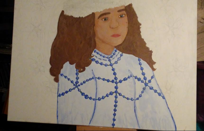
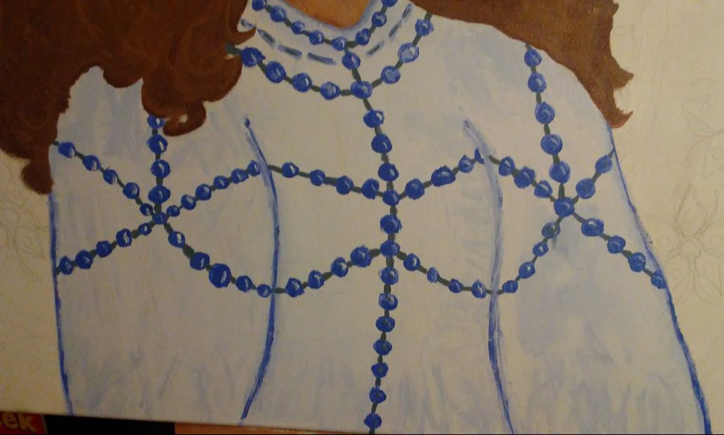
Then, while I still had the hair tones, I painted the beaded shirt using whites and blues. For the shirt I used the titanium white and very little ultramarine blue and for the beads I mixed the ultramarine blue with a small amount of titanium white.
|
|
|
Next I painted the wheat and flower crown. For the flowers I mixed ultramarine blue and titanium white, and mixed titanium white and cadmium red light hue. For the wheat I used cadmium yellow medium hue, titanium white and some of the hair tones to create the brown effects on the wheat.
|
|
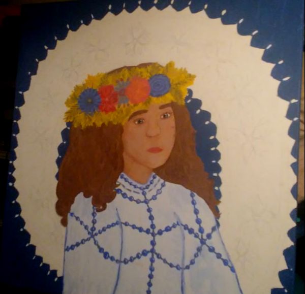
Using titanium white, ultramarine blue, and a very small amount of the cadmium red light hue to give it an indigo look. I painted the farthest part of the background with this color.
|
|
Then, I created a more red purple color, by mixing the titanium white, cadmium red light hue, and ultramarine blue. I used this color to do more of the background on my piece on the interior of the background.
|
|
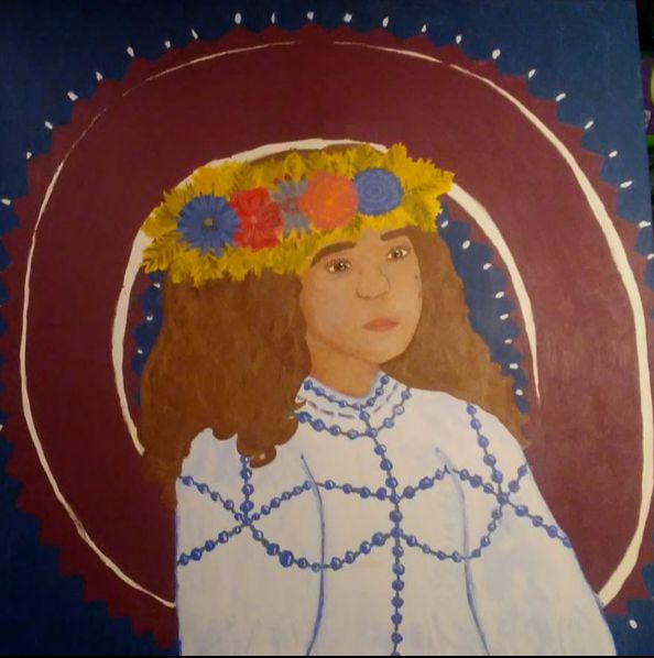
Once the purple color was dry, I mixed up a green color by using the cadmium yellow medium hue and ultramarine blue. I used this color to do the rings on the background.
|
|
|
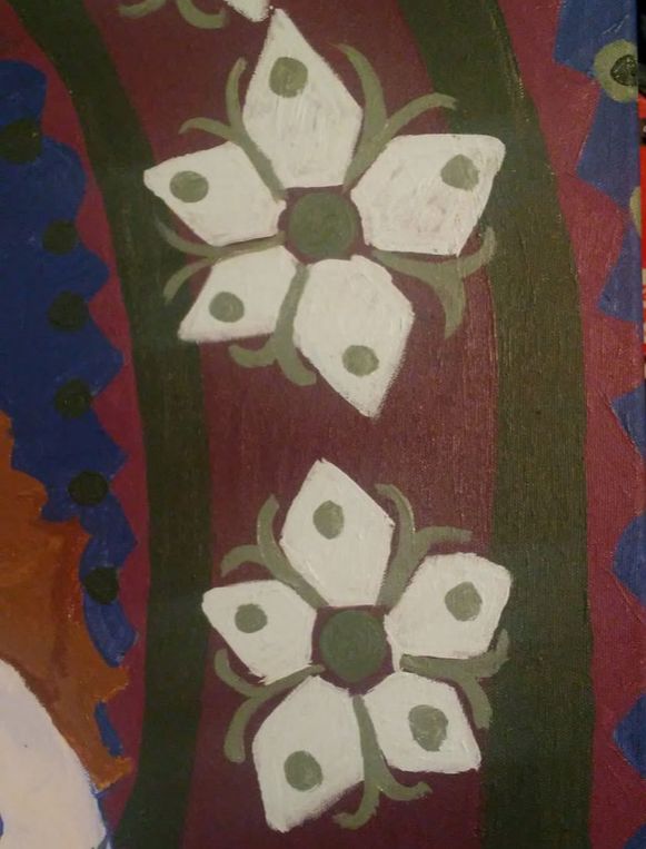
Using titanium white and adding a tiny bit of ultramarine blue, I painted the petals of the flowers and then I took the greenish color I created before and added some titanium white to help create the accents to the flowers and the dots on the triangles on the outside of the circle.
|
|
Once all of the paint was dry I took a flat brush and began to outline certain parts of the piece with the mars black paint. I only outlines the major parts of the piece like myself and parts of the background in order to make them stand out from the other parts of the piece.
|
Reflection
Compare & Contrast
|

CritiqueOverall, I guess I like how my piece turned out, but there are some things that I would change. I would use more warm colors for the background and possible outline with a thinner brush size. I would also begin by projecting an image of myself instead of using the grid method because I want the piece to look more accurate. I would also spend more time on the skin and fix up the nose because it is my least favorite part of my piece right now. Lastly, I would pick a more fluid and organic-looking pose for myself so that I do not look as stiff and forced into the piece.
|

ACT
|
Clearly explain how you are able to identify the cause effect relationship between your inspiration and its effect on your artwork?
Mucha's infusion of Czech culture within his piece and use of geometric versus organic shapes inspired me to use similar patterns and elements of culture within my piece. What is the overall approach the author has regarding the topic of your inspiration? The writers for the Muchafoundation.org website had a straightforward and factual approach to the reasons of why my inspiration pieces were created in the first place by Mucha. What kind of generalizations and conclusions have you discovered about people, ideas, culture, etc. while you researched your inspiration? I concluded that people around the world will always be proud of their cultures and unintentionally or intentionally will always seem to include aspects of their own culture as inspiration. What is the central idea or theme around your inspirational research?. The central theme behind my inspirational research is the aspects of the Czech culture and what the culture traditions and art is like. What kind of inferences did you make while reading your research? I inferred that the artist depictions of the Czech culture are accurate and that the patterns and colors are similar among various types of Czech art. |
BibliographyNorman Rockwell Museum, www.nrm.org/MT/text/GirlMirror.html.
“Poster for 'Bières de la Meuse' '(1897).” Muchafoundation.org, http://www.muchafoundation.org/gallery/browse-works/object/46 “Poster for 'Job' Cigarette Paper (1896).” Muchafoundation.org, www.muchafoundation.org/gallery/browse-works/object_type/posters/object/44. “Poster for 'Moët & Chandon: Dry Imperial' (1899).” Muchafoundation.org, www.muchafoundation.org/gallery/browse-works/object_type/posters/object/52. |
